
I love reading Changelogs - but I hate writing them. Here's what's changed with SuperTinyIcons since I launched it in 2017. It's a project to create SVG logos of popular services in under 1KB. Maximum filesize is 1,023 bytes. New Contributors! What started off as just me noodling around, has now attracted over 60 contributors! Some just drive-by and make a single change, others stay for a…
Continue reading →
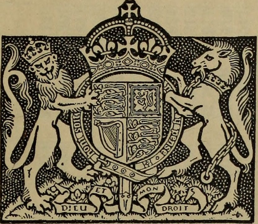
When the NHS was launched in 1948, this leaflet was sent out to everyone. I wanted to recreate the coat of arms that was on top to print on a t-shirt. Sadly, the scan available is too low a resolution for most modern purposes. Wikipedia has vector logos of most of the coats of arms - but not this one. In desperation, I emailed the College of Arms. They sent me back the most delightful LMGTFY …
Continue reading →

A little mathematical / spatial / design problem I've been having. I have an icon which, depending on the user's preference, can be inside a square or a circle. Is it possible for it to be centred in both? Here's a visual example. On the left is the AirBnB logo centred in a square. When the background is turned into a circle, the logo appears to "drop" - the bottom of the logo is closer to the …
Continue reading →

After much kerfuffle, the world has finally got used to the new Google logo. Well, almost. My eye is continually caught by the poor contrast of the yellow "O" against its background. Take a look... This is Google's default logo on its regular grey background. The contrast ratio between the yellow and grey is 1.50. That fails to meet current accessibility guidelines. This is just awful - I …
Continue reading →